MxCAD App Calling Internal Dialog Boxes
Preface
During the secondary development of the MxCpp APP, to maintain the unity of the project by following the internal style of the project, we provide an interface to call the internal dialog boxes of the project. Users can operate and call the internal dialog boxes of the project according to the steps introduced in the following document according to their specific needs.
Basic Calling
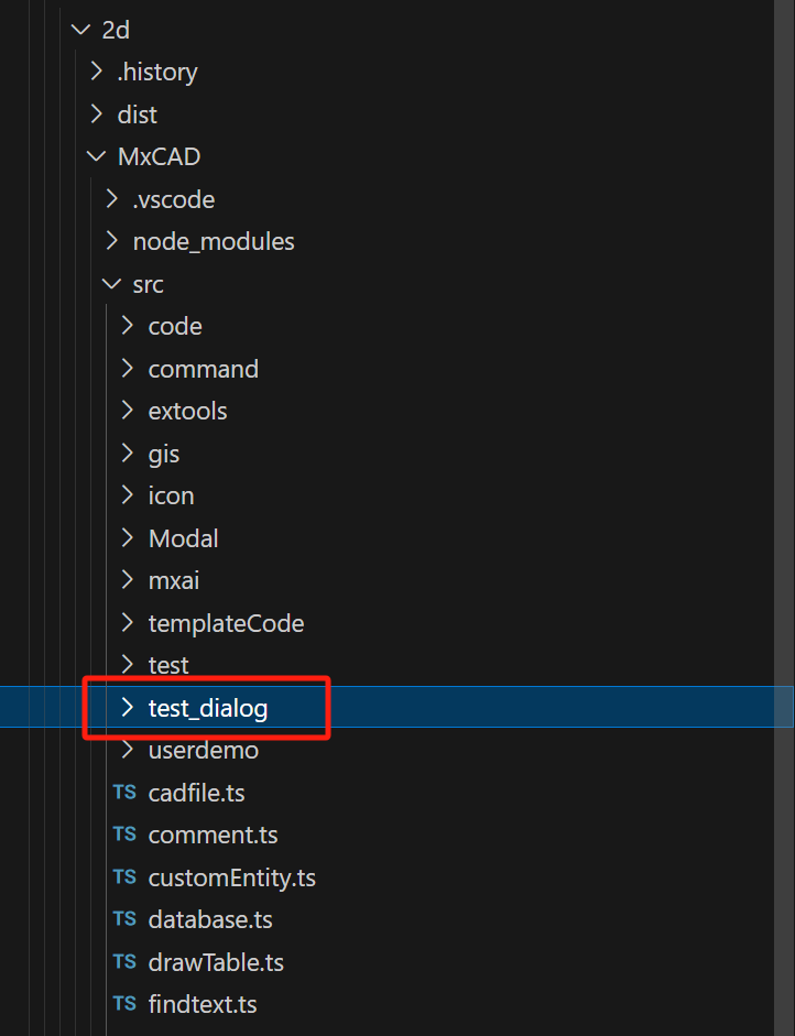
First, create a test_dialog folder to store files related to the dialog box.
Create a dialog.ts file under the folder to register the dialog box
// dialog.isShow.value is false by default
// If no command is passed in, the dialog box can only be displayed by modifying dialog.isShow.value or calling showDialog
// If a command is passed in, calling the command will automatically display or close the dialog box
// If a third parameter is passed in, the implementation of this command will be customized
export const dialog = MxPluginContext.useDialogIsShow(
    false,
    "Mx_test_dialog",
    () => {
        dialog.showDialog(!dialog.isShow.value);
    }
);- Create a dialog.vue file under the folder to build the dialog box UI interface
<script setup lang="ts">
import { ref } from "vue";
import { VBtn } from "vuetify/components";
import { dialog } from "./dialog";

const { MxDialog } = MxPluginContext.components;
const footerBtnList = [
  {
    name: "Cancel",
    fun: () => {
      // The cancel button of the dialog box is clicked, pass in data
      dialog.cancel({ data: 1 });
      // Need to send data first before closing the dialog box
      dialog.showDialog(false);
    },
  },
  {
    name: "Confirm",
    fun: () => {
      // The confirm button of the dialog box is clicked, pass in data
      dialog.confirm({ data: 2 });
      dialog.showDialog(false);
    },
    primary: true,
  },
];
const { isShow, onReveal } = dialog;
const title = ref("Test Title");
onReveal((data) => {
  // Receive the display message
  if (data.title) title.value = data.title;
});
</script>
<template>
  <MxDialog
    :title="title"
    v-model="isShow"
    max-width="300"
    :footerBtnList="footerBtnList"
  >
    <h4>This is a test dialog box!</h4>
    <VBtn>Test Button</VBtn>
  </MxDialog>
</template>- Create an index.ts file under the folder to create the dialog box in the interface
import { createVNode, render } from "vue";
import dialog from "./dialog.vue";

const el = document.createElement("div");
document.body.appendChild(el);
const vnode = createVNode(dialog);
const app = MxPluginContext.getApp();
vnode.appContext = app._context;
render(vnode, el);- Finally, import the test_dialog/index.ts file into the src/index.ts file in the MxCAD project
import './test_dialog/index'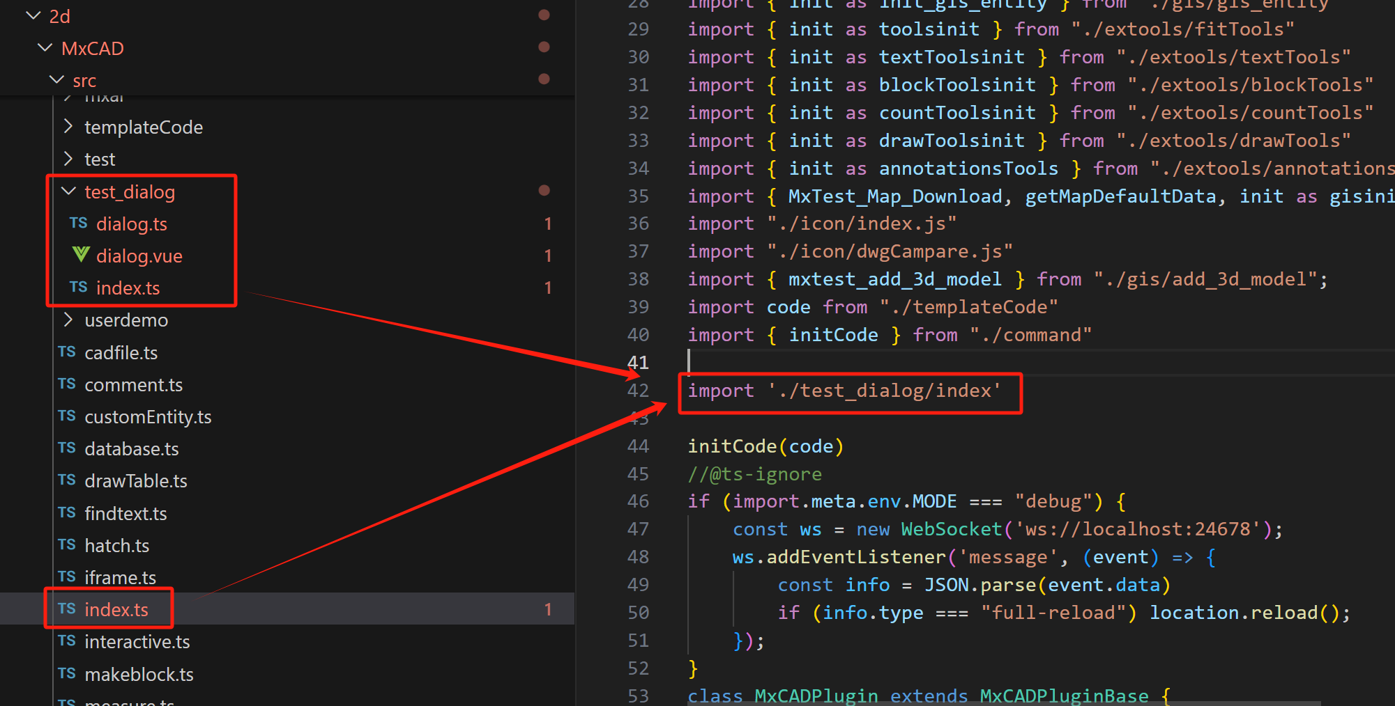
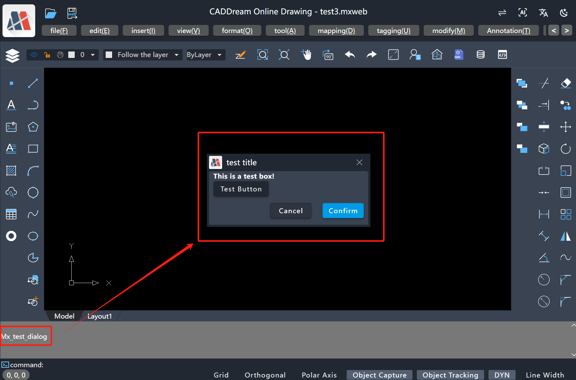
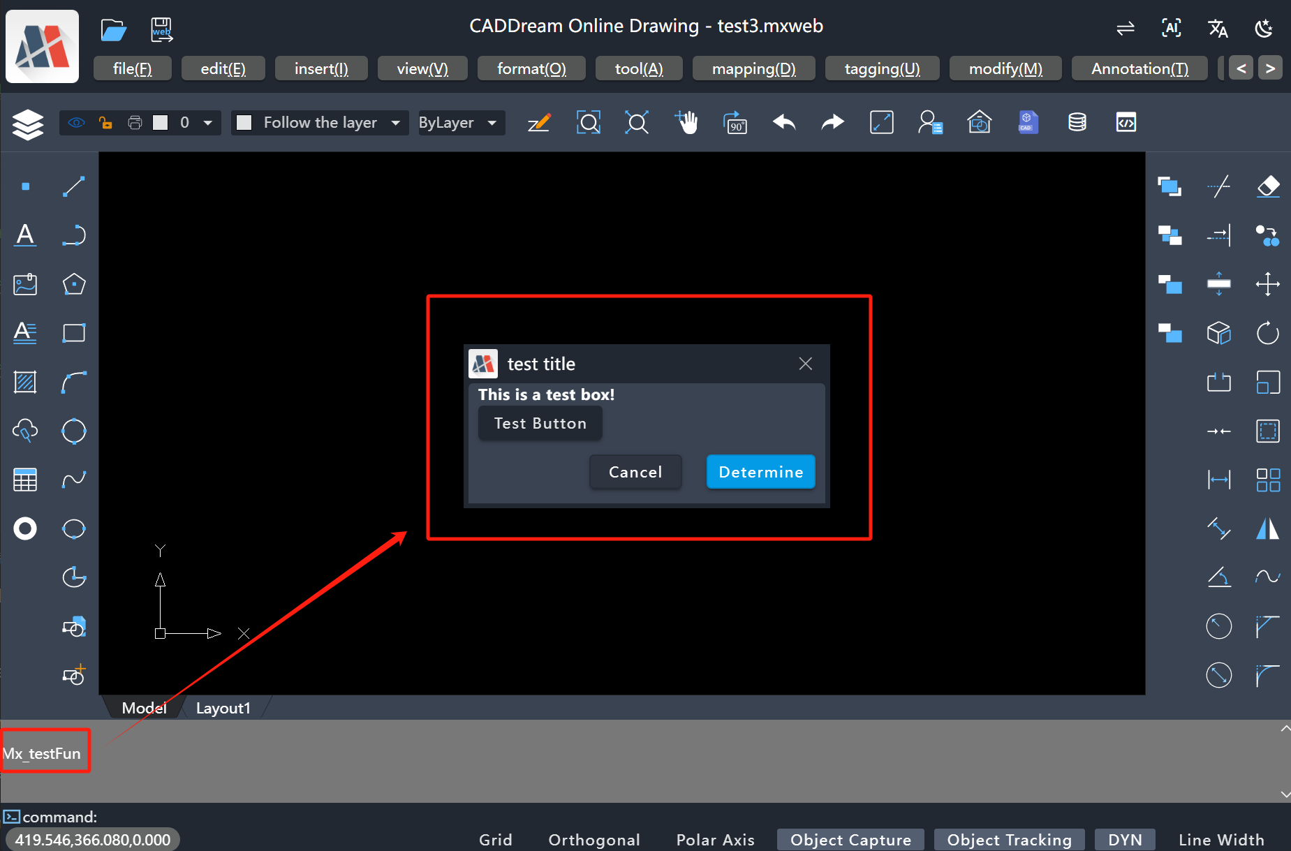
Start the MxCAD project, and execute the registered 'Mx_test_dialog' command above to display the dialog box. The running effect is as follows:
Advanced Calling
By following the above steps, users can directly control the display and hiding of the project dialog box through command line calls. However, in actual development, there are cases where the display and hiding of the dialog box cannot be directly controlled by calling commands, but by directly calling code. Therefore, we provide the useDialogIsShow property, and users can directly control the dialog box by controlling useDialogIsShow. The operation steps are as follows:
Call the useDialogIsShow hook function under the dialog.ts file to define the data types to be processed when the dialog box is displayed, confirmed, and canceled through type parameterization
ts// Data to be displayed in the dialog box type RevealData = { title: string }; // Data to be passed in when the dialog box is confirmed type ConfirmData = { data: number }; // Data to be passed in when the dialog box is canceled type CancelData = { data: number }; export const dialog = MxPluginContext.useDialogIsShow< RevealData, ConfirmData, CancelData >();Write the vue component of the dialog box normally under the dialog.vue file
ts<script setup lang="ts"> import { ref } from "vue"; import { VBtn } from "vuetify/components"; import { dialog } from "./dialog"; const { MxDialog } = MxPluginContext.components; const footerBtnList = [ { name: "Cancel", fun: () => { // The cancel button of the dialog box is clicked, pass in data dialog.cancel({ data: 1 }); // Need to send data first before closing the dialog box dialog.showDialog(false); }, }, { name: "Confirm", fun: () => { // The confirm button of the dialog box is clicked, pass in data dialog.confirm({ data: 2 }); dialog.showDialog(false); }, primary: true, }, ]; const { isShow, onReveal } = dialog; const title = ref("Test Title"); onReveal((data) => { // Receive the display message if (data.title) title.value = data.title; }); </script> <template> <MxDialog :title="title" v-model="isShow" max-width="300" :footerBtnList="footerBtnList" > <h4>This is a test dialog box!</h4> <VBtn>This is a test button!</VBtn> </MxDialog> </template>Register and render the dialog box under the index.ts file
tsimport DialogComponent from "./dialog.vue"; import { createVNode, render } from "vue"; const el = document.createElement("div"); document.body.appendChild(el); const vnode = createVNode(DialogComponent); const app = MxPluginContext.getApp(); vnode.appContext = app._context; render(vnode, el);Same as the basic usage above, import the test_dialog/index.ts file into the src/index.ts file in the MxCAD project
Finally, call the dialog in your own method to directly control the dialog box
tsfunction test() { /** * Code to be executed before popping up the dialog box */ dialog .showDialog(true, { title: "Test Title Display" }) .then(({ data, isCanceled }) => { // It will be triggered only when cancel or confirm is called if (isCanceled) { // Call dialog.cancel({ data: 1 }) to cancel console.log("Data of dialog box cancellation", data.data === 1); } else { // Call dialog.confirm({ data: 2 }) to confirm console.log("Data of dialog box confirmation", data.data === 2); } }); }ts// Register the above method MxFun.addCommand("Mx_testFun", test);The running effect is as follows:
Extension
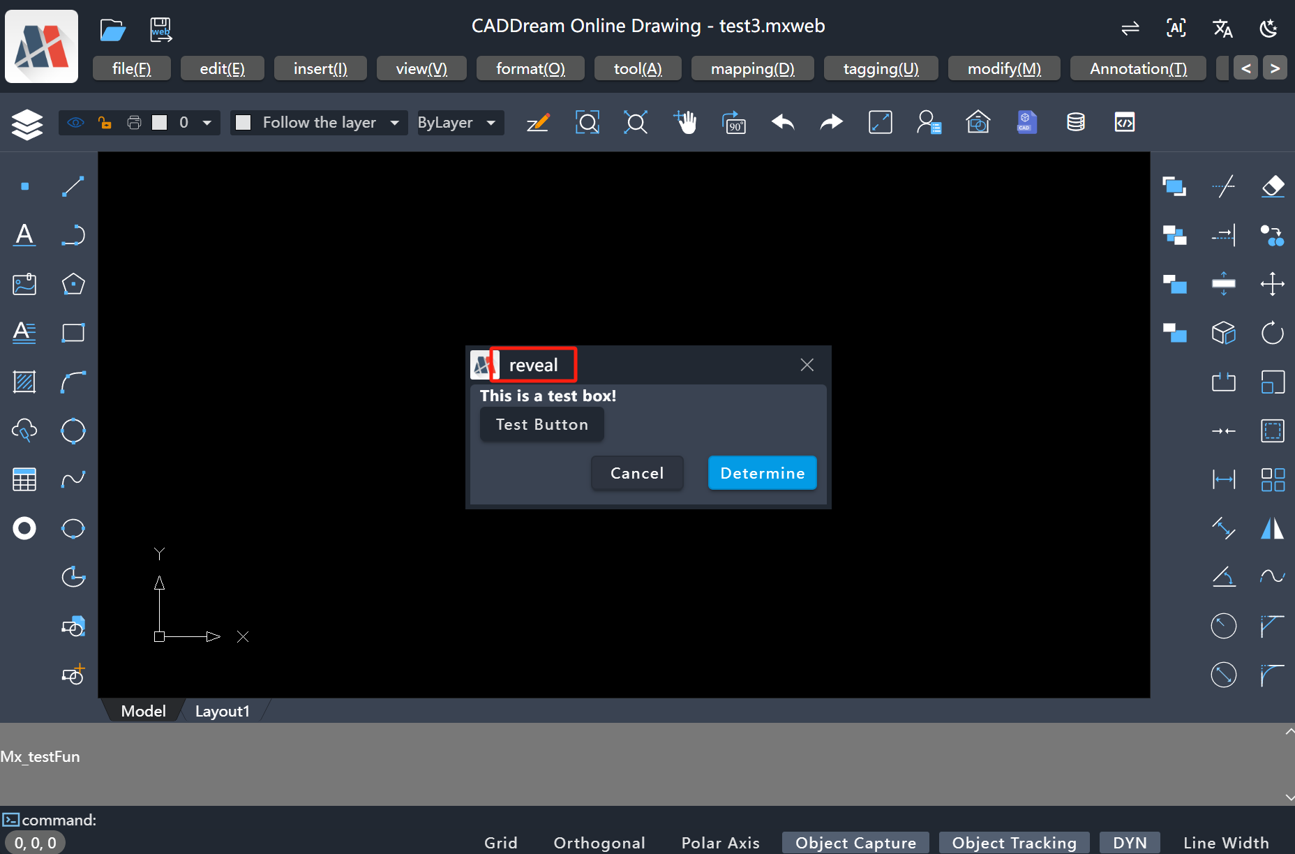
Directly call the dialog.reveal() method to invoke the dialog box
tsimport { dialog } from "./dialog"; dialog.reveal({ title: "reveal" }).then(({ data, isCanceled }) => { console.log('Confirmation parameters', data); console.log('Whether canceled', isCanceled) });The running effect is as follows:
Get data by listening to confirmation or cancellation events
ts// Listen to the confirmation event dialog.onConfirm((data) => { console.log('Confirm', data) }); // Listen to the cancellation event dialog.onCancel((data) => { console.log('Cancel', data) });
Style Adjustment
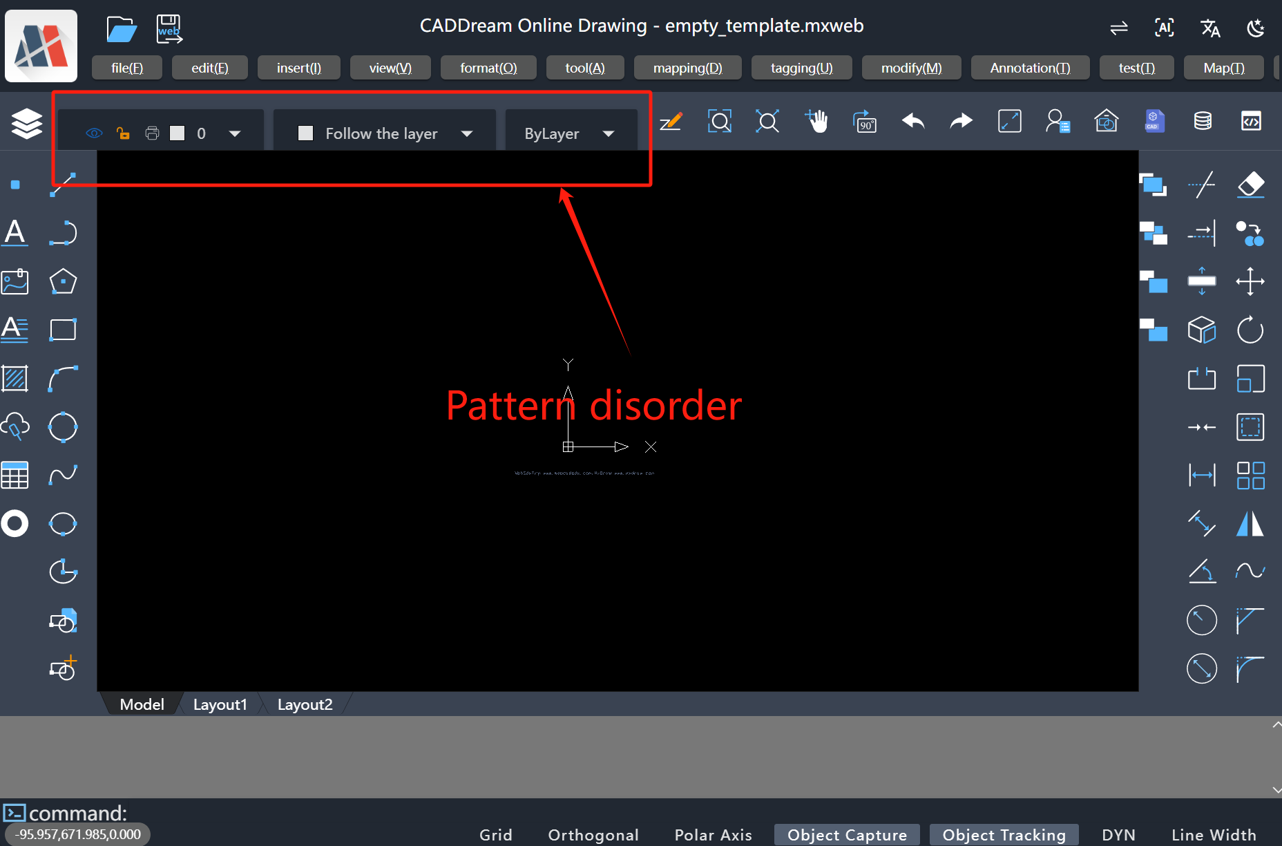
When users call the internal dialog box of the MxCAD APP, when introducing internal components of
vuetify/componentsinto the dialog box, style disorder or stacking may occur. This is because the component styles that come withvuetifyconflict with the styles encapsulated inside the MxCAD APP. We only need to set the call to the internal styles of the MxCAD APP in the vite configuration file, and the specific operations are as follows:Introduce internal components of
vuetify/components, and the MxCAD APP has style disorder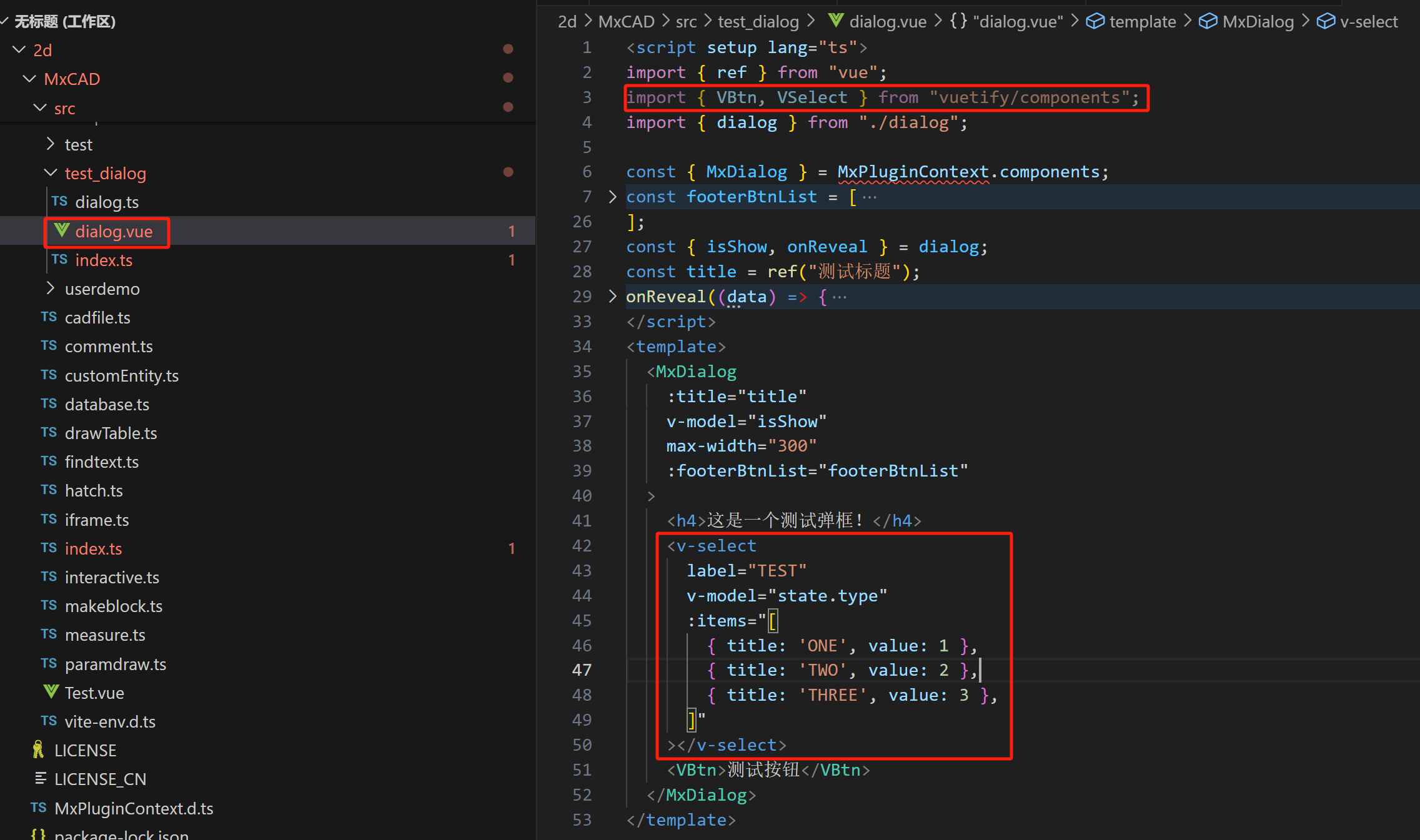
Configure
vite.config.ts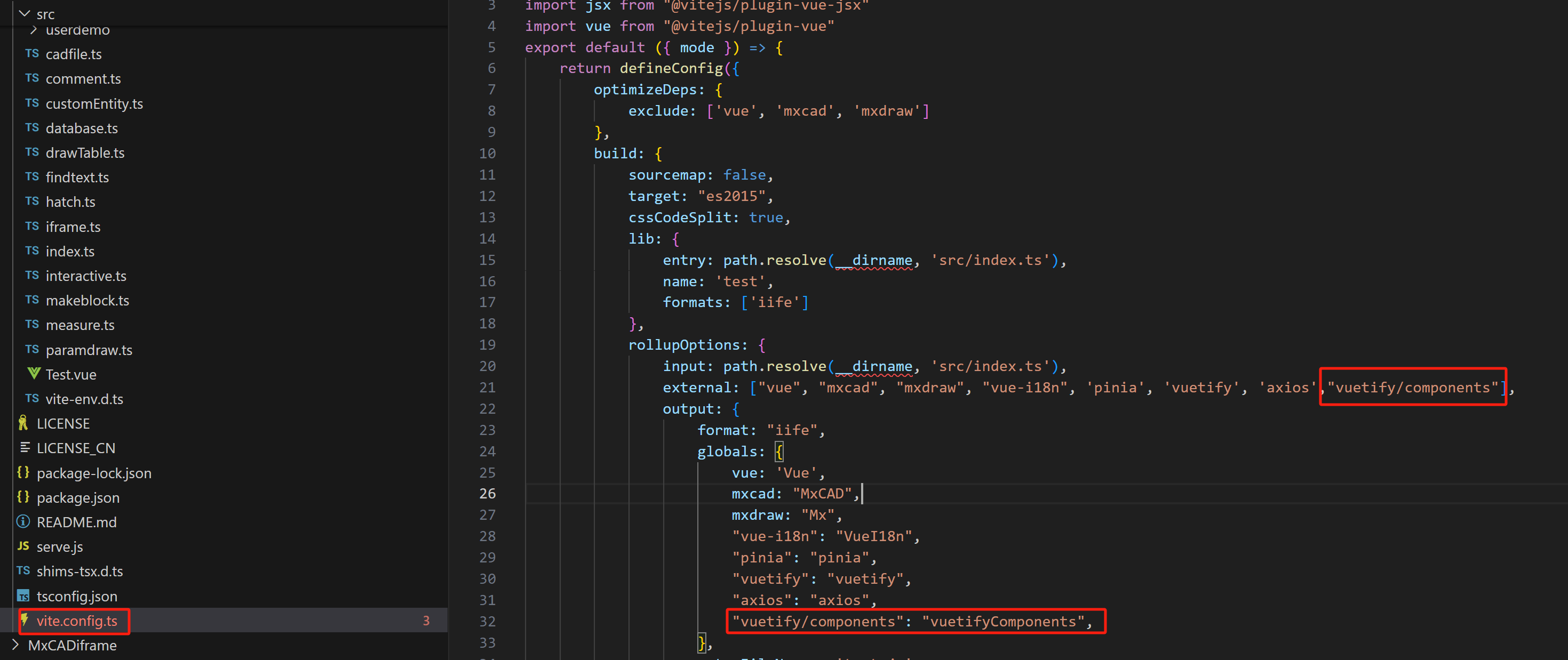
Return to normal after restarting the project